Saturday, July 21, 2012

Second Time Stenciling

After my first attempt at stenciling and seeing the results, I was ready to try again. Doing it correctly this time. Or so I thought.

I got my wax paper out and what I wanted to stencil on and cut off a length of paper.

Most of the tutorials I read talked about printing on the paper the cutting it out with an Exacto knife or with a pair of scissors. I was ready to do this before I remebered something important.

We have a Cricut! Hello! stick the wax paper to the mat, waxy side down, and have it cut out your image. Genius!


Once I did that, I went and ironed the paper to what I was working on. (We'll come back to this part.) Then I used my paint and painted onver the stencil.


Another wonderful jar of 50 cents paint.

When I was taking the stencil off, the first thing I noticed was that getting the middle off presented somewhat of a challenge. The second thing I noticed is that I left bubbles when I ironed on the paper and the paint seeped under. (I have quite a seepage problem.) But, like my last project, it grows on me and while it's not exactly what I wanted, I think it's nice and I'll do something with it.


Friday, July 20, 2012

A Father-Daughter Project

One Saturday, not to long ago, we were cleaning out one side of our two car garage so that two cars could both park inside at the same time. During ths clean up, an old PVC screen door came out of the corner. When asked if either my mother or I wanted to keep it, I said yes.

I had rather lofty ideas that we could turn it into one of those Shabby Chic jewelry holders/displays that you see all over Pinterest. With it being PVC, I knew it wasn't going to be able to fulfill the Shabby part of Shabby Chic. Nonetheless, I wanted to try it.

Now, granted, I didn't want to start right then and there. In case you didn't know, summers in Georgia are HOT. I was already ready sweating and not looking forward to doing to much more of it. I put it on the backburner for things to do before the summer's over.

Well, my wonderful father saw no reason not to do it the second we had a chance so, off we went.

The process didn't take very long and it was so spur of the moment I didn't even think to take pictures.

Once we had zip ties and poultrey mesh chicken wire from Home Depot, we came home, removed the hardware, and washed the door. Remeber, this thing has been in a garage for A WHILE.

(Once again, this was a PVC door. we didn't think it would hold up to a staple gun thus, the zip ties.)

Using the bed of a truck for a work surface, we laid out the cicken wire over the door frame and zip tied it into place. (The chicken wire didn't lay quite flat so we strategically looped the zip ties throught the holes in the chicken wire to tighten and flatten it.

We thought we were done in about an hour and a half. The problem was, the ends of the chicken wire. We couldn't cut them off because then zip ties wouldn't be holding anything and it would all come apart. We didn't quite know what to do so, we just let it sit.

Then, my Dad had a great idea. We could use the thing that attached the hinge to the door frame and use it as a cap on the ends of the door. Genius.

Once that was done, the door was truly finished. Now it's waiting for me to clean out a spot in my room so I can use it to display/hang my multitudes of jewelry. And I do mean multitudes.

It came out a little more Industrial than Shabby Chic but, I think some ribbon over the zip ties and some pretty fabric here and there will do just the trick.

My Dad couldn't be more excited that he could help me with a crafting project and neither can I. This means he can help me with some bigger projects I have planned.

*Laughs Villianous laugh*

He has no idea what he has gotten into nor how much I love and appreciate him and all he does for me.

(This would have been a good Father's Day Post wouldn't it?)

Thanks Dad.


Thursday, July 19, 2012

First Time Stenciling

I've been seeing posts everywhere talking about the wonders of freezer paper stenciling. SOme of my favorites are here and here. I recently found some amazing fabric paint for an unbelievable price. I figured this was the perfect time to finally try it. However, I jumped the gun.


50 cents for the jar. How could I say no?

I was using my Mom's Cricut making some Thank You cards and I though, 'Why not use some thick paper for a stencil?' And off I went. I don't think anyone will be surprised when I say it didn't go exactly as I wanted. 


I used black paper so, when the paint seeped under the edges, it darkened in places. Not a crazy amount but enough to notice.


I guess sometimes you have to do something wrong to see why you HAVE to do it right. My new plan is to do what I did last time EXCEPT use freezer paper and iron it to the fabric so the paint won't seep through and won't change color.

Post to come of the results.

Tuesday, July 10, 2012

I Love My State Print Tutorial

Alas, all good things must come to an end. Today we have the third tutorial for digital prints, inspired by those found on Pinterest, and created using the web service PicMonkey. 

Without any further to do...

I Love My State Print Tutorial


Just as a reminder, we have here the inspiration.

Step 1.
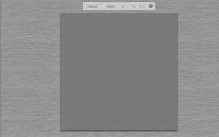
Go to picmonkey.com and choose edit a photo.


Step 2.
Open your background picture.
(If this is you're first time here or you don't remember how, please refer to this post on what I'm talking about and how to do it.)


Step 3.
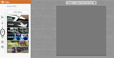
I find it helpful to go ahead and crop the picture at this point if you plan to use a service to print your poster. Otherwise, you may have to crop and cut off letter or the resolution may not be good and so forth and so on.  When you go to the left and select the Basic Edits function, Crop will be the first option. When you select Crop, there will be a drop down menu that will more than likely say 'No Fixed Proportions.' Click on this drop down menu and select the size you plan to have it printed as. I will do mine as an 8x10.


Step 4.
The best way to crop you're background and still have room to make you're poster is to align the one of the corners of the crop box with the corner of you're background.


Once you've done that, drag the bottom corner to make the box as large as possible.


Step 4.
Time to go on a detour. You're going to want to find a silhouette of your state. To do this, Google it. It's what I did.


Step 5.
This next part may seem unnecessary but, trust me, it is necessary.
Open Microsoft Word, PowerPoint, or Excel and open your picture once inside the program.
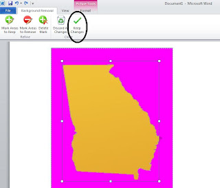
Then use the Remove Background feature.


Adjust the dimensions of the box to fit your state and select Keep Changes.


Right click and Save your image in a place you can find it.

Step 6.
Now let's head back to PicMonkey.
Once you click the Overlay/Sticker button, at the very top the is a button that says 'Your Own.' Click this button and a screen will pop up and allow you to choose one of your pictures. In this case, you will use your state image. Once in PicMonkey, you can change the color of your state as I did.


Step 7.
Go back to the left and you should still be under the Overlays tab. Once there, select the Hearts tab. You can choose any heart you like but, I liked the more traditional looking one.


Once you choose your heart, add it.

Step 8. 
Once you add your heart, it's highly recommended that you change the color. The sooner the better since you will no be able to see for it the background. You will also need to re-size it. Unlike every other tutorial I've posted. You will need to make the heart smaller. Well, you don't NEED to BUT it make the city you're trying to indicate easier to discern.


And you're done!

Congratulations! By following these three tutorials, you have increased your PicMonkey savvy by a bazillionfold. Enjoy making all sorts of fun, amazing and impressive prints.

Monday, July 9, 2012

Family Established Print Tutorial

I would like to present the second of three tutorials for how to make your own fabulous digital posters using the online service, PicMonkey.

Today's tutorial is for the Family Established Poster.


Just as a reminder, here's the inspiration.


Step 1.
Go to picmonkey.com and choose Edit a Photo.


Step 2.

Open your background picture.
(If this is you're first time here or you don't remember how, please refer to this post on what I'm talking about and how to do it.)


Step 3.
I find it helpful to go ahead and crop the picture at this point if you plan to use a service to print your poster. Otherwise, you may have to crop and cut off letter or the resolution may not be good and so forth and so on.  When you go to the left and select the Basic Edits function, Crop will be the first option. When you select Crop, there will be a drop down menu that will more than likely say 'No Fixed Proportions.' Click on this drop down menu and select the size you plan to have it printed as. I will do mine as an 8x10.


The best way to crop you're background and still have room to make you're poster is to align the one of the corners of the crop box with the corner of you're background.


Once you've done that, drag the bottom corner to make the box as large as possible.


Then click apply over on the left.

Step 4.
While you're over on the left, select the Text feature.


Once there, select the font you would like to use, I used Arial Black, and type the first letter of the last name you're doing and click Add.


(Once you've added your letter, you can change the color. I just kept mine in the default white.) 

Step 5.
Now you re-size the letter to take up most of the space. To re-size, drag a corner or line of the box surrounding the letter. 


Step 6.
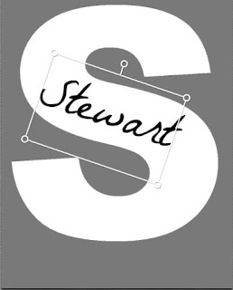
Unselect the letter you just made. You'll know you've unselected the letter when the white box goes away. Go back to the text box on the left and type the letter of the last name you're doing. I think it goes without saying you'll want to pick a different color than that of your letter, but just in case... I also went with a different font but, that's up to you.


Step 7.
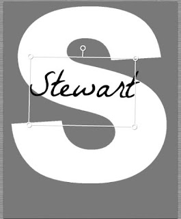
Using the circle sticking up at the top of the box surrounding the name, rotate the name to position you like. Depending on your letter and name an so forth and so on, there's a lot of room to play.


Step 8.
Unselect the last name. Go back over to the text box and type Est. and the year. I used a different font again in the same color of the name on the letter. Once again, all up to you. No matter what, you'll more than likely need to re-size it. Use the same steps as before to re-size it to fit your page.


And there you have it. Another digital print tutorial delivered to you by Merritt's Marvels.

Stay tuned for the third tutorial, I Love My State.


Sunday, July 8, 2012

Alphabet Print Tutorial

In my last post, I displayed prints I created with PicMonkey and they're Etsy inspirations. I also said that there would be tutorials to come and here's the first.

Alphabet Poster


Just as a reminder, here's the inspiration.


Step 1. 
Go to picmonkey.com and choose edit a photo.


Step 2.
Open your background picture.
(If this is you're first time here or you don't remember how, please refer to this post on what I'm talking about and how to do it.)


Step 3.
I find it helpful to go ahead and crop the picture at this point if you plan to use a service to print your poster. Otherwise, you may have to crop and cut off letter or the resolution may not be good and so forth and so on.  When you go to the left and select the Basic Edits function, Crop will be the first option. When you select Crop, there will be a drop down menu that will more than likely say 'No Fixed Proportions.' Click on this drop down menu and select the size you plan to have it printed as. I will do mine as an 8x10.


The best way to crop you're background and still have room to make you're poster is to align the one of the corners of the crop box with the corner of you're background.


Once you've done that, drag the bottom corner to make the box as large as possible.


Then click apply over on the left.

Step 4.
While you're over on the left, select the Text feature.


Once there, select the font you would like to use, I used Arial Black, and type the letter A, and click Add.


Drag the corner of the letter until the letter is the size you want. This is really tricky. You have to make sure it's the right size to fit five letters in the row and six rows on the page. Five rows will be of letters and the sixth is for the 'is for (insert name here)' part. To find what size your letter is, look at the pop-up box and look at the number above the size slider bar.


 For a 5x7, a good size is around 200. For a 8x10, a good size is around 230. This should give you a good idea of what size your letters should be. 

Step 5. 
This is where the process gets tedious and you decide to just buy the print. Repeat step three for every letter of the alphabet. It can be a little difficult to make sure all the letters are the exact same size but then you don't have to be exact either. While you're creating and sizing you're letters, go ahead and put them in their rows. 


Since one row will have six letters (Whoops, did I forget to mention that earlier?), the best way to space the letters is to set the end letters and adjust the middle letters. 


(When you get to the letter of your name, go ahead and change it to the color of your choice. Take note to the color code you choose. This will be important a little later.)

Step 6.
Once you get all your letters lined up, it's time for the name part. Go to the text box and type 'is for __________.' I choose to use a different font than my alphabet. Remember the color code I mentioned earlier. This is where you look for it.


You can type codes here so you don't have to try and find the color manually. Type the color code you chose for you name letter for your phrase. 

Step 7.
More than likely you'll have to re-size your phrase to fit the dimensions of your poster. Once you've done that, you're done!


*****If you plan to make more than one, this will save you a lot of time. *****
Do all your letters in the same color and leave room for the name phrase then, save it. Open the saved poster, layer a colored letter over the plain ones, and add your name phrase. 
Again, saves a lot of time.

That's the end of the first of three tutorials for great digital prints.

Come back tomorrow for the Family Established Print Tutorial.


Saturday, July 7, 2012

Fun With PicMonkey

I recently did a post on how to knock off a boutique print with the website PicMonkey. I can't tell you how much I love this website. It has so many amazing features and it's FREE. For whatever reason, I've just been playing with it non-stop. I take that back. I know the reason why. I see prints on Pinterest on I want to see if I can make and tweak them a little bit. (Darn you Pinterest.)

Next we'll have a little photo montage of prints I found on Pinterest, followed by my versions made with PicMonkey.


M is for Merritt


Stewart Family Established 1983


I Love Georgia

I'll admit, I was lazy and used the same background color for everything but since, at the time, I didn't know for sure they would work, it seemed like less of a waste of time should they not work. 

Tutorials to come at a later date. If you find that you simply can't wait or feel you don't have the computer savvy, feel free to go to the Etsy stores and buy them.